Data Infographics Design Process
Published on February 15, 2023
2min to read
How did I make it?
So this is the first time I have ever tried making anything like this, designing a visualization that is more in line for infographics and print work. My goal was to challenge myself to present data a little differently from the traditional means, focusing more on aesthetics while not sacrificing too much readability. Before this, I have taken Fredrica's Course, and seeing her process was helpful to kind of shape my approach to making this visualization. Most of the heavy lifting is done in D3 and polished up on illustrator.
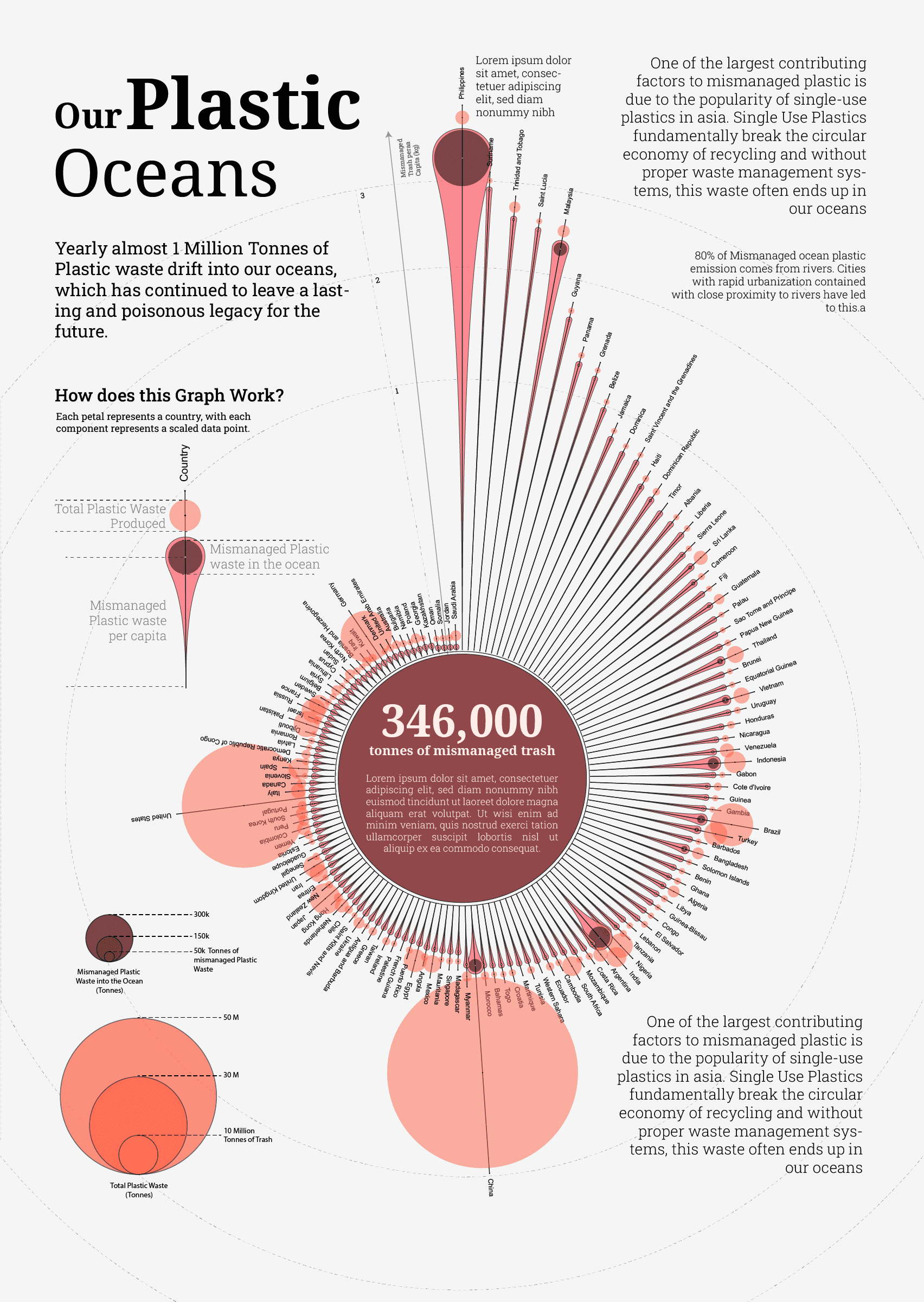
Data
The data I chose is about mismanaged plastic in the ocean, and the source is from ourworldindata. Although, I have done a scrolly-telling visualization centered around this data before, this time I wanted to try and capture the same story but present them in just 1 visualization.
Design Process
During the design and ideation process, I spend a lot of time drawing while browsing Pinterest for inspiration. Sketching and storyboarding was something I have personally found to be effective in trying different shapes and structures that my data can be associated with. I also try to keep in mind how different scales (log, linear, sqrt) could affect the design.
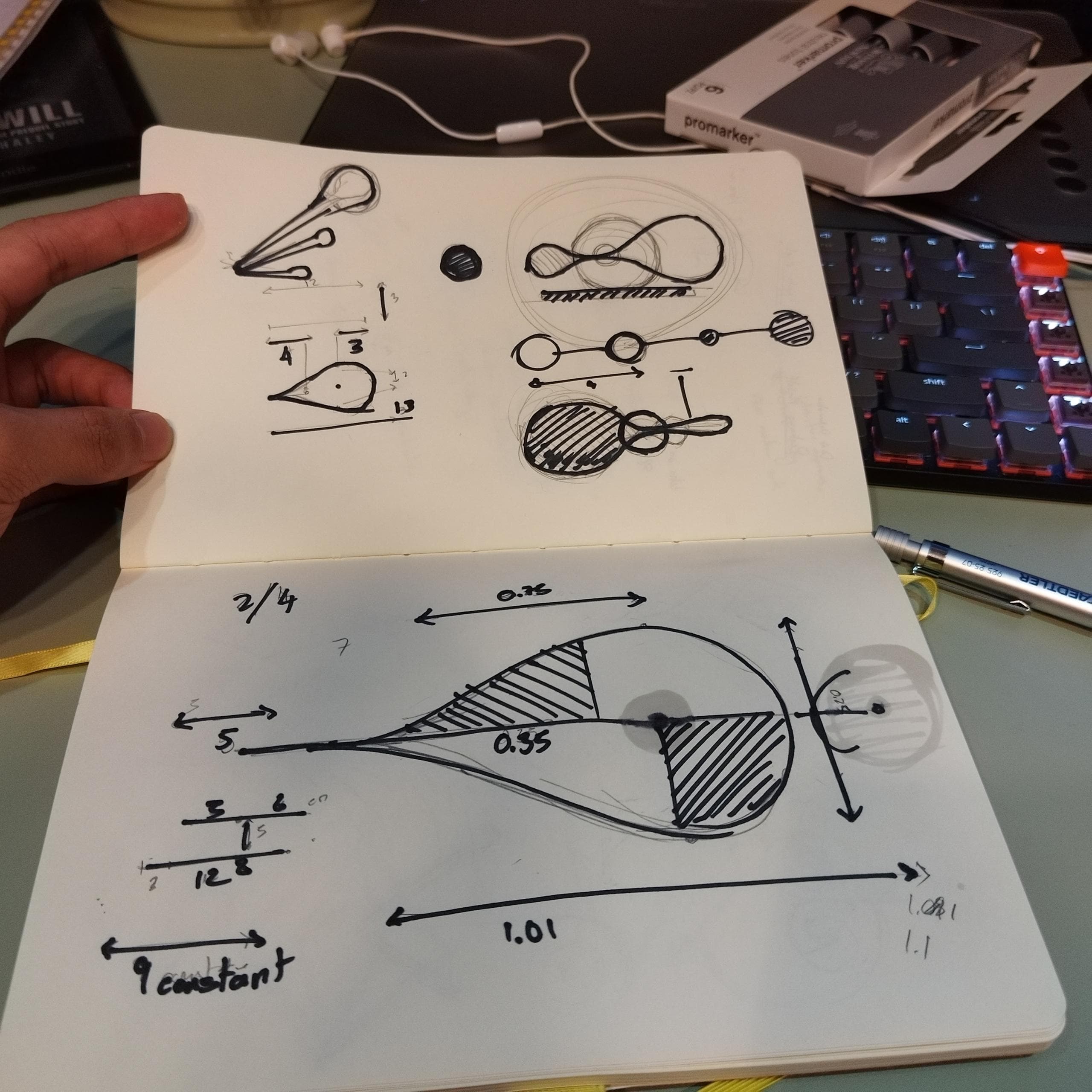
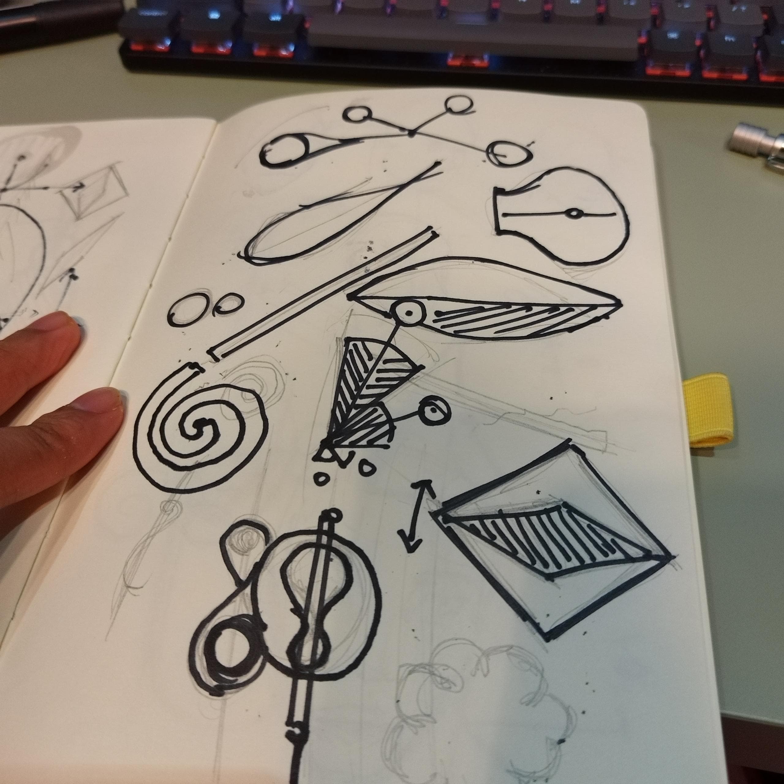
I am terrible with the drawing tablet, so I try to just sketch in a notebook. I ended up with something that looks like a water droplet, where I can associate its length and size with 2 separate variables.
Prototyping (D3 with Observable)
For the prototype I do enjoy working on observable a lot, it allows me to quickly iterate on the design and add inputs so I can adjust the look and feel of the visualization quickly. Link to my observable prototyping
Annotation, Clean Up, and Conclusion
With my prototyping done on d3, I exported it as an SVG then imported it into illustrator to add descriptions, annotations, and scale markers. Later posted it on r/dataisbeautiful and got shared as the top visualization for the day and got a lot of good feedback and criticism. Overall it was an interesting short project that gave me time to try and pour more creativity into my visualization.